
Chiara Alduini
Creative Director | Brand Identity & Visual Systems
New to Contra
Chiara is ready for their next project!
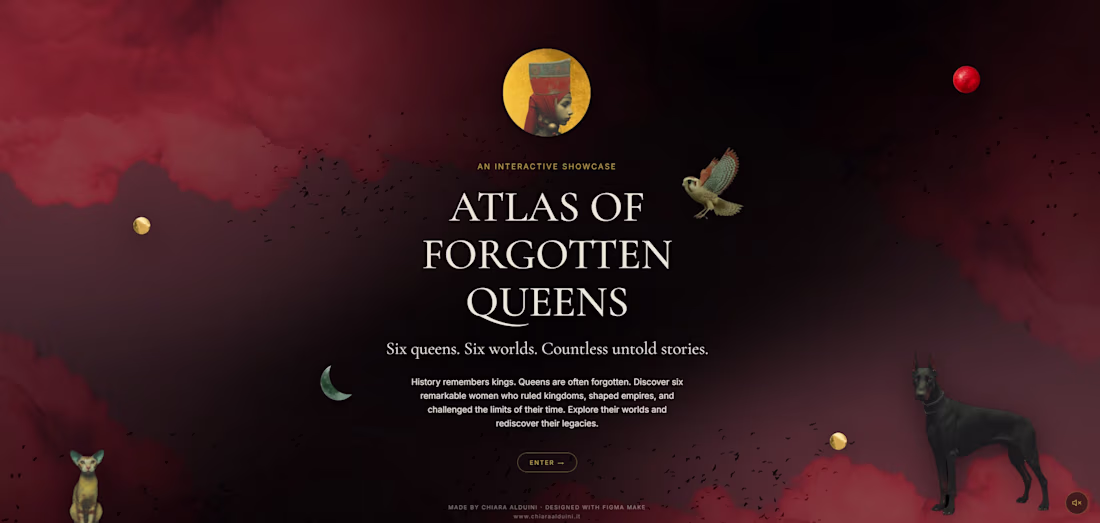
Atlas of Forgotten Queens
Six queens. Six worlds. Countless untold stories.
History remembers kings. It often forgets queens.
The idea | Atlas of Forgotten Queens is an interactive visual-storytelling project that reimagines six historical women rulers — Zenobia, Nefertiti, Dihya, Tamara, Roxelana, and Artemisia I — through a symbolic, narrative-driven lens. Rooted in historical research across different cultures and eras, it focuses on influential women whose stories have been overlooked in traditional history.
The approach | Rather than presenting history as a fixed reconstruction, the project translates it into a layered visual language where meaning is suggested through imagery, atmosphere, and symbolism. It is at once an archive and a reinterpretation — each queen sits between documentation and imagination, a shifting image shaped by symbols, suggestion, and a subtle sense of myth.
The craft | Each queen is built as a digital collage combining photography, original illustration, and AI-generated imagery, fused into a single portrait that reads as historical identity reinterpreted, never literal reconstruction. Each queen's name is written in her own historical script — Egyptian hieroglyphs for Nefertiti, Tifinagh for Dihya, alongside Arabic, Georgian, and Greek — so that each ruler is named in her own writing, not only in ours.
The process and tools | The project was designed, prototyped, and built in Figma Make, used both through its AI-driven generation and its code editor for precise refinement — Figma Make is the spine that turns the concept into a living, interactive site. Around it sits a wider creative pipeline: Photoshop and Illustrator for visual development and the gold-line maps; Midjourney for image generation; Gemini to compose the original score "The Last Prayer of the Sultan"; and Claude to develop and structure the narrative. The result is a genuine multi-tool, AI-and-manual workflow, with Figma Make at its center.
The experience | The site unfolds like a museum. A soft, slowly drifting haze with floating, parallax collage elements gives way to a gallery of circular portraits; each queen's page reveals her in colour and invites the visitor to read symbolic hotspots placed directly on the artwork. The Geography of Silence gathers all six rulers onto a single map — where they ruled, and where memory let them fade. The Language of Emblems is the project's lexicon, collecting the recurring symbols — the hawk, the fox, the colour red — and reading them in their universal meaning: a key to the clues marked on each portrait. The journey closes with The Unwritten, where the names of other forgotten queens — Sheba, Amanirenas, Nzinga, Boudica, and more — surface and fade around a final illustration: an unfinished, ever-expanding tribute to the countless women still waiting to be remembered. The experience is fully responsive across desktop and mobile: on smaller screens it is rethought for touch rather than scaled down, with a collapsible menu, a pinch-to-zoom map, and enlarged tap targets.
If you've read all the way to here — thank you for your interest! 😊
Figma Site | https://atlasqueens.figma.site/
(https://atlasqueens.figma.site/)Share | https://www.figma.com/make/uXm8S9lkymkTd8URAjmj6C/ATLAS-OF-FORGOTTEN-QUEENS?p=f&t=twAEHRsb3gv3aWaI-0
Community | https://www.figma.com/community/file/1646095544450556274
5
13
1.3K
Project Title:
TimeMap — Historical World Explorer
Short description:
TimeMap is an interactive historical world map explorer that lets you travel through time and space simultaneously. Select multiple cities and archaeological sites from different parts of the world and see what was happening at the exact same moment in history.
What I built:
An interactive web app where you can:
Search historical cities and archaeological sites
Compare up to 4 locations simultaneously across 5,000 years of history
Navigate through 7 historical eras via an interactive timeline
Filter by world region
Listen to era-appropriate ambient music
Explore a vintage cartographic map with wave ocean texture
How I used Google Stitch:
I started from a personal infographic I designed in Adobe Illustrator and Photoshop about the Korean Peninsula. I extracted the visual DNA — warm cream palette, coral accents, serif typography — and brought it into Google Stitch to prototype the interface. Through multiple iterations in Stitch I designed the map layout, the side panel, the leader portrait, the timeline and the editorial aesthetic. Stitch was the bridge between my design vision and the final development in Claude Code.
Workflow:
Adobe Illustrator + Photoshop → Google Stitch → Claude Code
Project link:
https://timemap-explorer.netlify.app/
Feedback on Stitch:
Stitch is genuinely powerful for rapid UI prototyping. Iterating visually with prompts saved enormous time. The design consistency across iterations was impressive. Areas for improvement: handling complex SVG elements like world maps was challenging, and version history navigation could be more intuitive.
16
13
1.3K
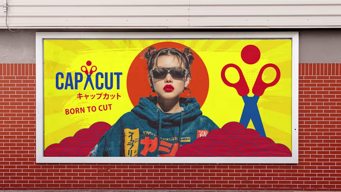
CapCut reimagined as a Tokyo streetwear brand, Born to Cut 😉 A complete brand identity inspired by 1980s Japanese advertising: bold yellow, navy blue, and red. Logo, campaign posters, packaging, and merchandise. Built with CapCut Design Studio
28
56
3.9K
CapCut presents: Fragments of Memory
A retro-Tokyo mood film — extension of the Brand Identity Challenge entry
This project is an extension of my original challenge entry: "Reimagine CapCut – Tokyo Streetwear Brand Identity"
https://contra.com/community/BBshwH0R-reimagine-cap-cut-tokyo-streetwear-brand-identity?r=chiaraalduini
It expands the concept by introducing a motion layer that explores how the brand behaves in movement, bringing the identity system into a more dynamic and applied context.
While the original submission focused on the visual identity system — logo, typography, color palette, and static applications — this addition completes the narrative by translating the brand into motion and reinforcing its Tokyo streetwear-inspired aesthetic.
Together, both parts form a single cohesive exploration of how a digital tool like CapCut can be reimagined as a cultural and fashion-driven brand system.
Born to Cut — but sometimes, born to remember. 🎌
#CapCutDesignStudio #BornToCut #TokyoVibes
0
326

Educational Visual Identity & Storytelling System for “Discover Petra with Ahmad”
Project Overview
Educational and cultural storytelling system developed for “Discover Petra with Ahmad”, a bilingual learning experience designed to make the heritage of Petra accessible to younger audiences through narrative, illustration, and interactive formats.
The project combines cultural strategy, educational design, and visual storytelling to translate complex heritage content into an engaging and intuitive learning experience. It was developed in close collaboration with a non-profit organization operating within a UNESCO context.
Scope
Creative Direction · Cultural Strategy · Narrative Design · Art Direction · Character Design · Educational Book Design (Arabic/English) · Museum & Educational Collateral · Interactive Learning Experience
Client SELA (Jordan)
Sela is a non-profit organization founded in 2015 by members of local communities living around the UNESCO World Heritage site of Petra. Its mission is to actively involve Jordanian communities in the protection, interpretation, and sustainable preservation of their cultural heritage.
1
505
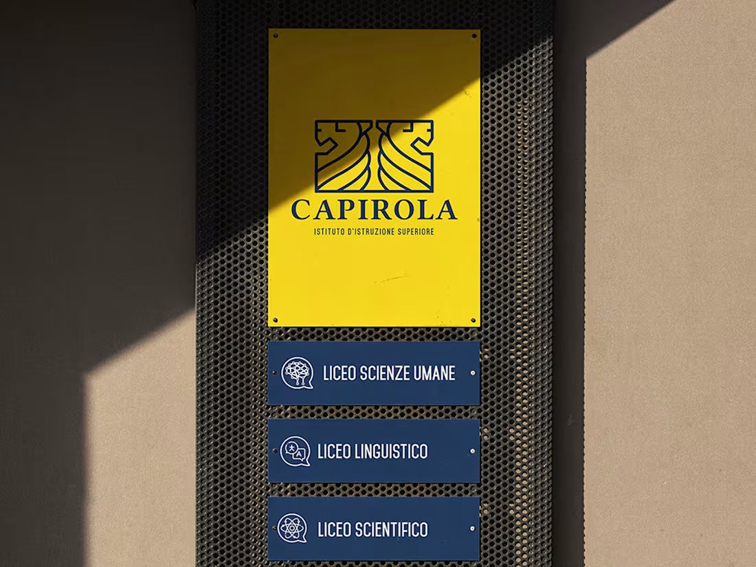
Vincenzo Capirola High School — Logo & Brand Identity
Logo and visual identity for Istituto Superiore Vincenzo Capirola, Leno (Brescia). The pictogram draws from the stylophorous lions of the local Leno Abbey — ancient stone guardians whose distinctive diamond-wave manes became the geometric core of the mark. The system includes logo, colour palette (institutional navy and academic yellow), stationery, wayfinding icon system for three academic programmes, and signage. Full identity from concept to physical application.
0
310
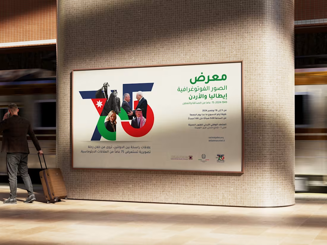
Italy–Jordan 75 Years · Italian Embassy Amman
Complete visual identity for the 75th anniversary of diplomatic relations between Italy and Jordan, commissioned directly by the Italian Embassy in Amman. Scope: custom logo design, bilingual brand guidelines (Italian/Arabic), exhibition design at the Jordan National Gallery of Fine Arts, and full collateral — rollup banners, billboard posters, official invitation, and brochure. A diplomatic identity built to carry institutional weight across two countries, two scripts, and three languages.
0
315
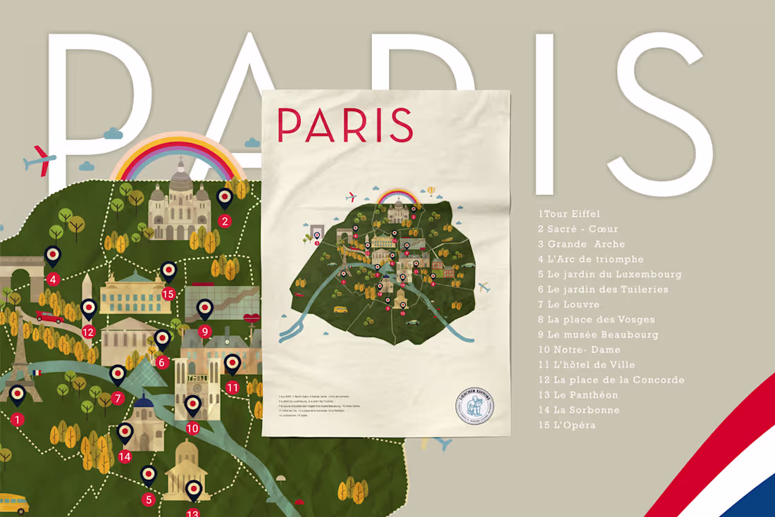
Illustrated Maps — C'est La Classe!
Illustrated maps designed for C'est La Classe!, a French language course book published by Loescher Editore — one of Italy's oldest educational publishers, founded in 1861. The project required translating complex geographic and cultural data into clear, engaging visual systems suited for secondary school students. The series includes five maps covering Paris, France, francophone countries, festivals, and French cultural stereotypes — each built in Adobe Illustrator using a consistent flat illustration language with custom-drawn icons, warm cartographic tones, and a red and navy palette referencing the French tricolore.
1
360
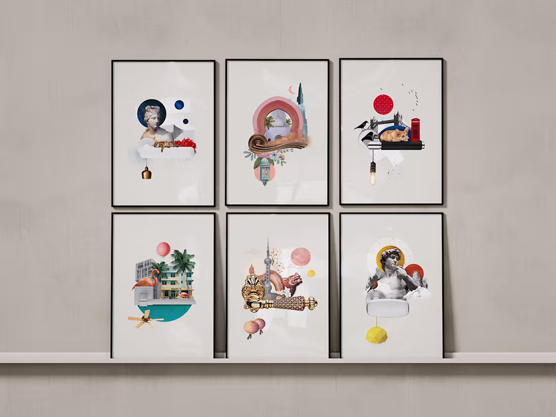
Linea Calì Calendar 2023
13 collage illustrations for the annual calendar of Linea Calì, an Italian manufacturer of architectural hardware. Each piece explores the cultural, historical, and symbolic identity of a country where the brand is present — with the handle always at the centre: not decoration, but threshold. Deep iconographic research, layered digital collage, and a consistent visual language across the entire series.
0
304