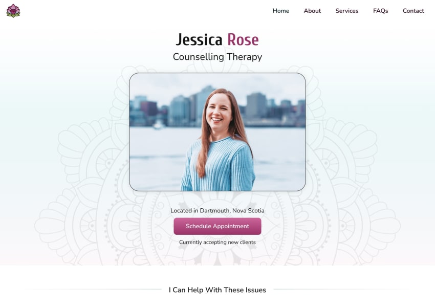
Webflow Design and Build for Jessica Rose Counselling Therapy

Matt Pike


The Story
Jessica asked me to build her a custom website for her new private practice, working as a Registered Counselling Therapist. She also needed a logo and some branding, so I made a roadmap for the project:
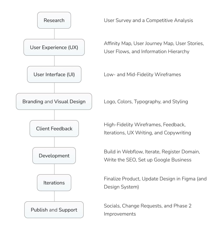
Research
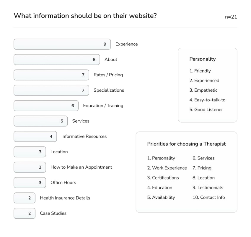
For this, I conducted a User Survey of twenty-one people. Here is the report, and below are the results that guided the design the most. (Note: the participants often gave multiple answers to each question, so the results often don't add up to 21)
User Experience (UX)
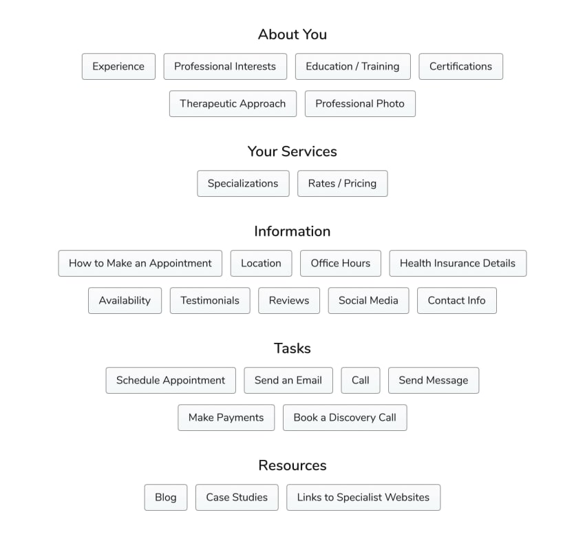
From the User Research, I made an Affinity Map of the data points I gathered (74 in total, after removing overlaps), and below are a few of the groupings.
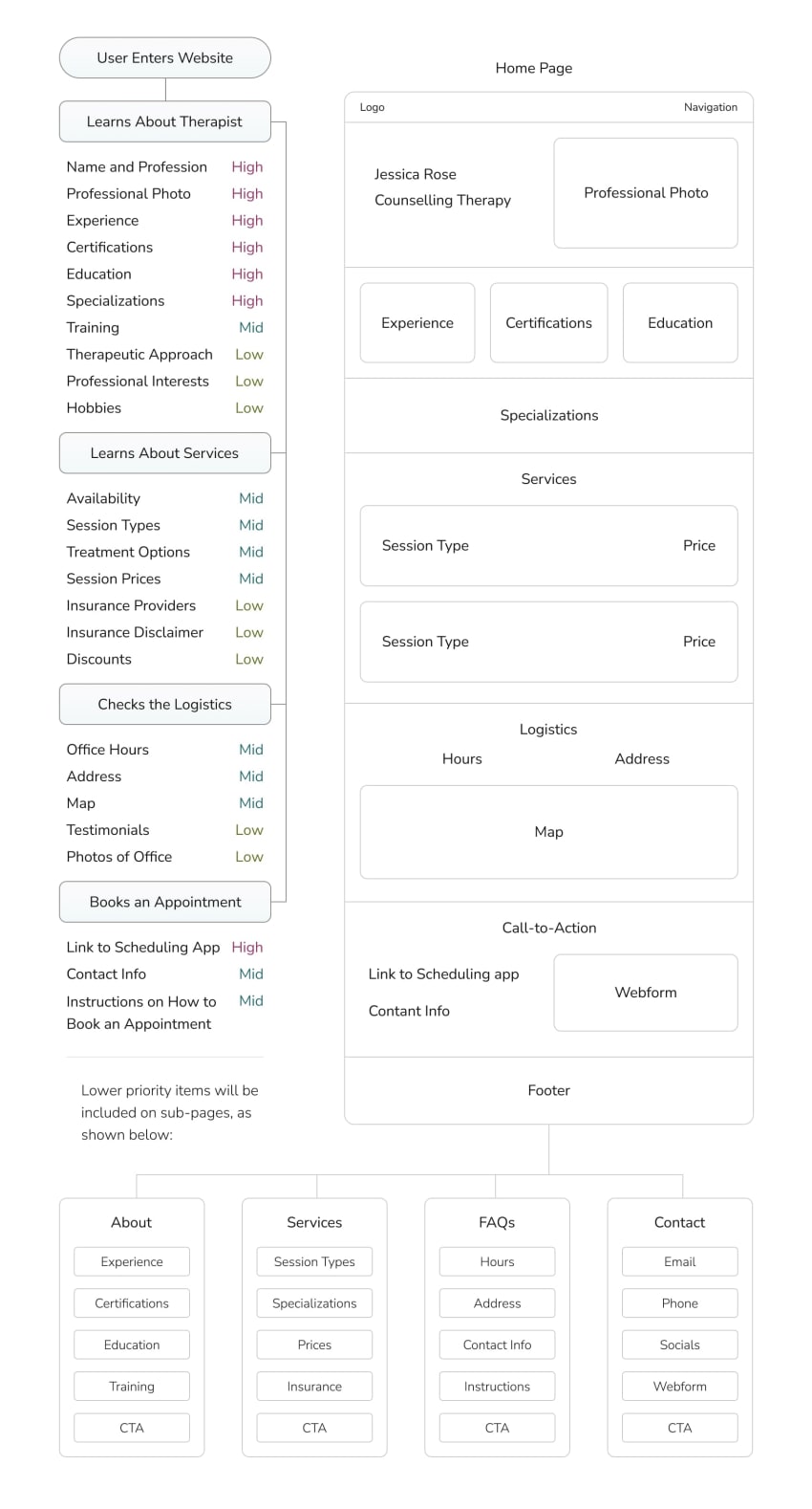
Then I made a User Journey Map, which helped Jessica and I to establish the Minimum Viable Product — what her site needed to have on day one. For example, some of the users I tested (and Jessica included) wanted to have a blog-style database of mental health resources, but it wasn’t an immediate priority, because it wasn’t critical to whether or not the user booked an appointment, so it could come in Phase 2 of the design.
Next, I extracted the most-important User Epics, which then became User Stories and Feature Requirements. For the Information Hierarchy, I used the answers from the User Research to prioritize the features, and then I used them to create the first iteration of Low-Fidelity Wireframes.
User Interface (UI)
Now that I had a low-fidelity skeleton, I moved into mid-fidelity by using what I’d learned from my Competitive Analysis — and by playing around with different layouts and components. Below is what the Home Page looked like as I began to work on the Visual Design and her Brand Identity.
Branding and Visual Design
Jessica asked me to use her favorite colors — fuchsia and teal — which I liked, because they went nicely with the insights that I'd gathered from the User Research: that the users wanted their Therapist to be kind and friendly — someone who instills hope. Next, I searched for images of roses and found the perfect match: the Rainbow Rose.

My first instinct was to make her logo a rose as well, but Jessica had a better idea: a lotus, which represents regeneration and rebirth; out of even the dirtiest of waters, a beautiful flower may grow. She also had started her career in Vietnam, where the lotus is prominent — along with the Mandala. (After a few iterations, I was still able to sneak a rose into the design ... with client approval, of course.)
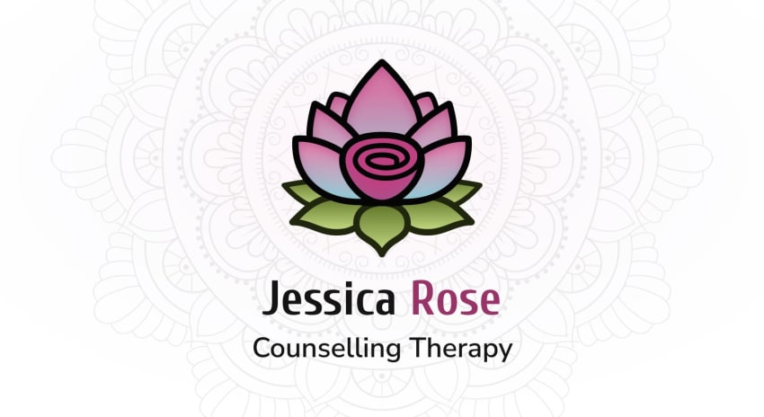
For the typography, I’d been using my own (Nunito Sans) as a placeholder, but Jessica liked it and wanted me to keep it because she thought it looked friendly — exactly what we were going for. However, I still thought we could do better with the headings, so I spent some time trying different combinations, until I decided on Cuprum, because I thought the curves looked friendly, inviting, and modern — and Jessica agreed, so we had a winner.
Client Feedback
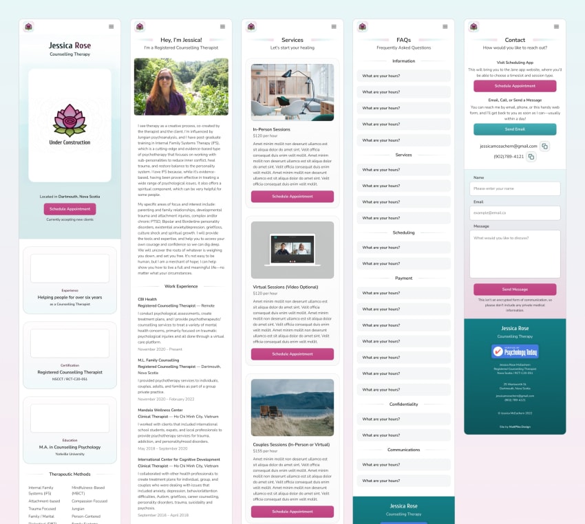
Next, I worked on the stylistic elements of the website — things like corner radii, background gradients, etc. — and the first iteration wasn't great, but since I'm both the designer and developer, I get to cheat and include more iterations as I'm building the website. Here are the mobile wireframes as I switched from Figma to Webflow.
Development in Webflow
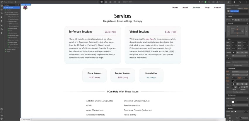
Here's the Webflow dashboard showing the Services Page for Jessica's website. Webflow is a what-you-see-is-what-you-get-software, which takes the underlying HTML, CSS, and Javascript code and displays it with a visual interface. The left panel is the HTML structure of the website — the pages, files, elements, and images — and the right panel handles the styling (CSS) and interactions (JS). The middle is a live-updated viewport that shows the desktop, tablet, and mobile breakpoints, where you can modify the HTML and update the content. It's super easy to check if the design is fully responsive, making development a breeze, and iterations as easy as dragging shapes and naming them.
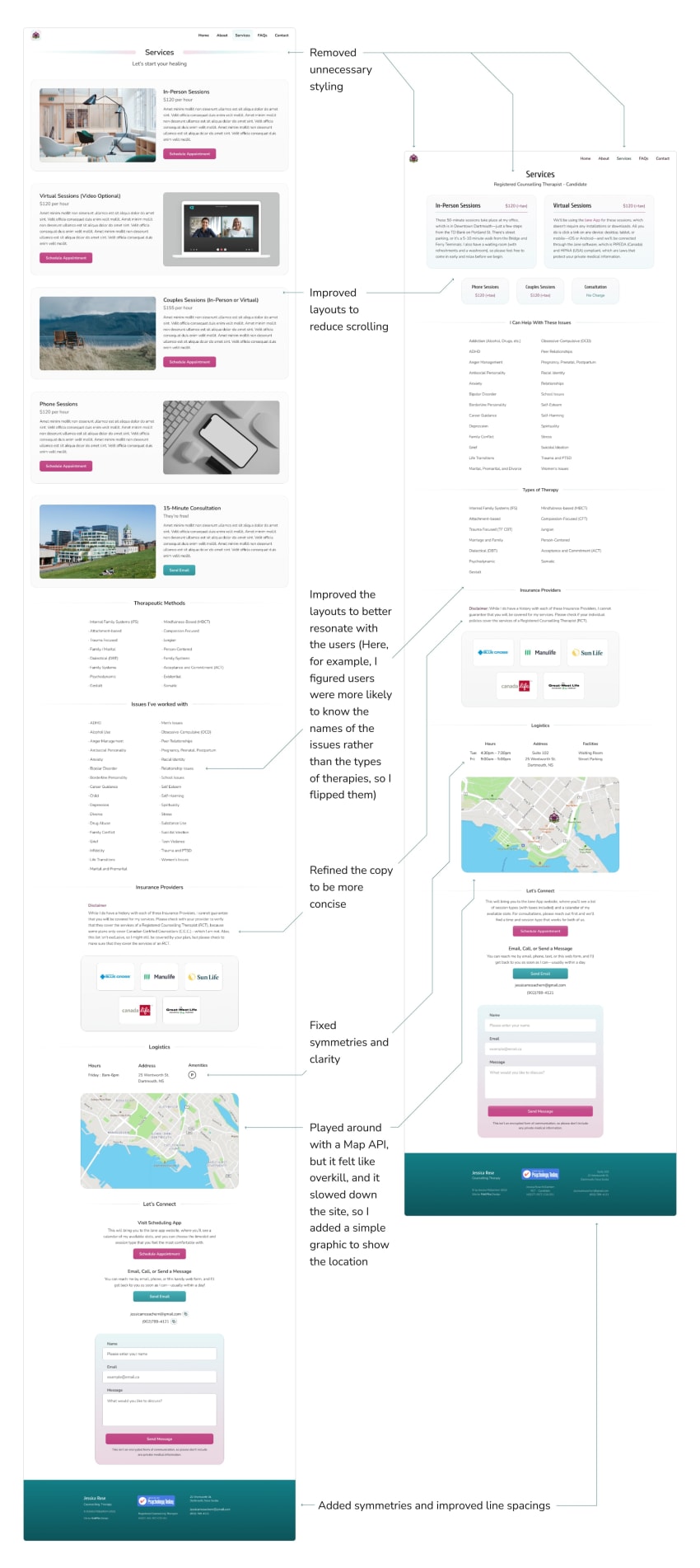
Below is a before-and-after of the Services Page, along with some annotations to highlight my thinking as I looked for improvements during this build iteration.
Iterations
We were nearing the end now, but we still had to wait for Jessica’s professional photograph before I could finish the home page, so I took the time to work with her on the copy for the site and her SEO strategy — the site metadata, image descriptions, etc. Once we had her photograph, though, it was pretty obvious that it just didn’t work.
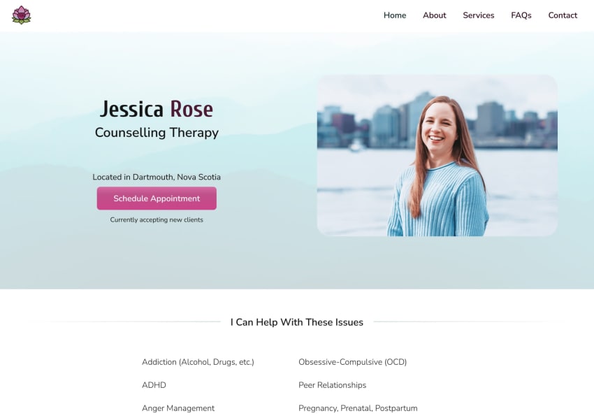
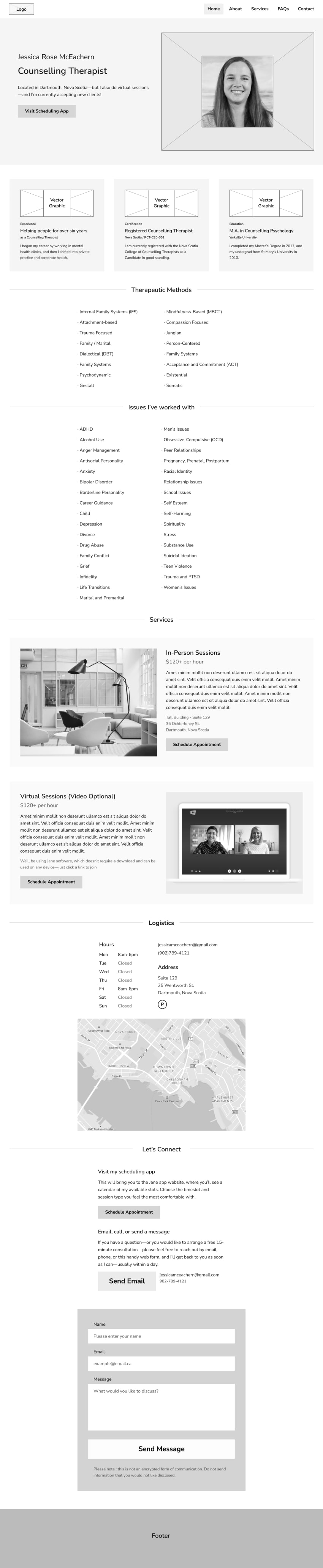
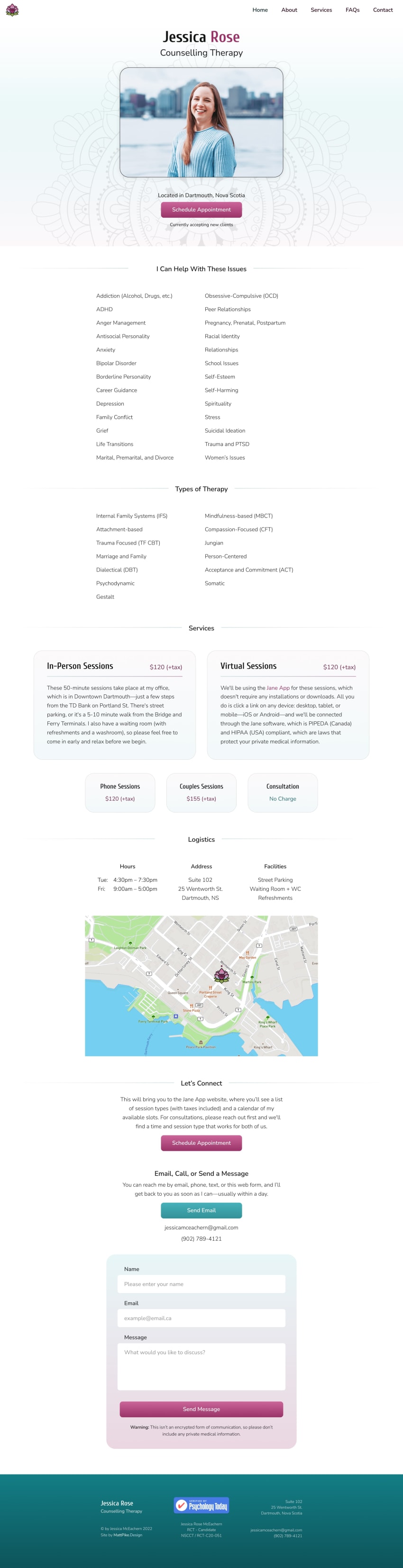
Aside from the obvious clash of teals and blues, the visual hierarchy needed a better sense of directionality. Here's the finished home page.
Publish and Support
Rather than showing you even more static wireframes, check out the website for yourself at JessicaRoseTherapy.ca.
Well, thanks for reading.
Cheers,
2021